A New Look for the Grow Network
As I’m sure you noticed, we’ve made some big changes to the Grow Network website. What do you think?
The biggest reason for all of these changes was to speed our site up. We were getting some feedback that the site was loading too slowly. Well… you spoke and we listened!
The Grow Network is Growing
It turns out that our biggest problem was… growth! We’ve added so many new articles, new series, new videos, and new photographs, that we simply outgrew our old site.
And the real [Grow] Network is growing too – you, me, and all of the people who make up our community. We are a big group! And there are new members signing up all the time, from all over the world.
I guess it takes a lot of megabytes for so many people to help each other grow their own food and medicine.
More Information, Fewer Distractions
And while we were working on the speed, we went ahead and made some other changes, too.
• Less Clutter – We straightened things up a bit, and really tried to focus the new site on what matters most – the information!
• No Advertisements – Again, we really tried to take away all of the distractions so that you can focus on the information in each article and video without being bothered.
• Friendly Navigation – You should be able to get where you’re going fast, with the sleek new menus on the left-hand side.
• Bigger Pages – Bigger pages help to keep the new design simple and clean. And bigger pages also mean we can use a bigger font for easy reading.
• Bigger Pictures – Now that we have Anthony on our team, we have more great photographs and videos to share, and now we can share them in full size.
We hope you like the new look, and we’d love to hear what you think about it. Leave us a note in the comments below and give us your 2 cents.







COMMENTS(21)
It looks great. Can’t wait to navigate it!
I like the look. It looks clean and polished.
The look is good, rather inorganic and maybe too clean. However, navigation is next to impossible. Most menu links don’t click at all, the ones that do still take forever to load.
I love it! Especially no ads. You and your team are doing a wonderful job!!!
Omo! LOL, i never really vid this kind of show, it81#2&7;s gonna be my first time, and maybe next week I will be able to do it. I’m so excited too!! Thanks a lot for the support!!
I went to “Shop”, found a book I was interested in and clicked on Buy Now…and I’m back at the Blog. What the heck?
Other than than, the load time for those pages I visited was good and yes it does appear clean and readable. I likely don’t have access to Premium Content but when clicking on interesting articles the page returned just said “You’re already logged in.” Something a little more informative would help. Maybe something like “Hey numbskull, you have to pay for that first!” 😉
Hi Dean – Sorry about that – we had a few bumps in the road getting the new site up and running – but those links should be working now. Thanks – Michael
I love the new look, clean and easy to view.
Glad you like it!
Looks nice and organized. The search facility is very useful.
It doesn’t seem that the Contact button works, but it may be my browser settings.
Definitely loving the look of this site compared to the old one, much easier to navigate!
I Love the new layout and ease of navigation through the site. You’ve done a wonderful job concisely communicating all of your information on every page with important information bold to catch the eye and just enough of a description to explain where the link goes. I LOVE LOVE LOVE the tabs on the left hand side. Makes it so easy to know where you are in the site.
However, and this is strictly constructive criticism, I think that the stark white background is a bit bland and jarring and doesn’t do an effective job of communicating the warmth that I feel when interacting with your operation. It’s hard to say what a good solution to this is. Maybe a half border around the top and right of the page that is a soft color present somewhere else on the site? I haven’t done web design in a long while and my company site is anything short of haphazard but you asked us to be honest!
I also think it would be cool to have a small graphic to couple the title of the featured articles on the right side. Nothing huge and distracting but something a little more fun than just a list. Great next step though! Congratulations! I know the stress of releasing a new website and you’ve done quite well.
Fratilor modemul exista dar trebuie sa ai neaparat OS(Operating sistem sau firmware) versiunea 3.0,Orange nu mieee,deastmenna poti si filma si s-au remediat peste 95% din defectele avute,deci puteti sa va luati linistit IPhone atata timp cat aveti OS 3.0
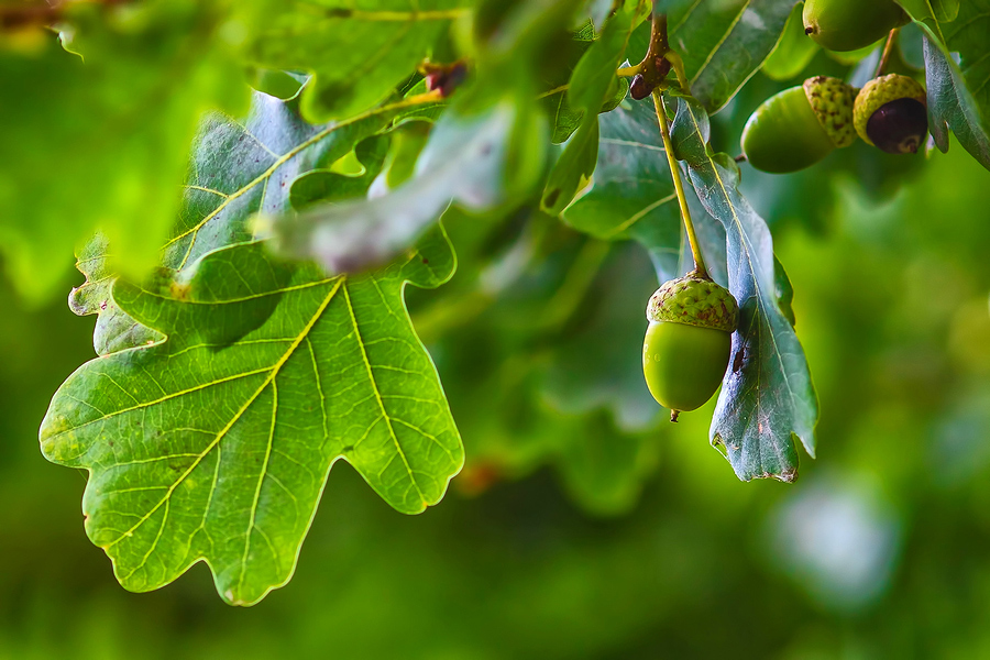
Awesoe leaf pic! Luv the site’s clean, uncluttered look … like looking down the rows of a well tended garden … Links seem to work ok, for me … sometimes slow downloading isn’t due to the source site as much as the receiving computer’s RAM and its internet server .. or so my experience has been. Thanks for listening to your customers/readers/followers/sprouts … as a seed is planted, tended, loved, it grows into a healthy plant producing new, stronger seeds to continue … so too, Grow Network is growing, changing, getting larger and stronger … to continue to plant new ideas that will populate and grow … Ah, life is good.
I just listened to your interview with Scott Pittman (2014) and how he started a credit union. Have you done any interviews with him, or have other info on this subject, and where would I find it? Thanks!!
Sharon
p.s. I really enjoyed the 2016 Home Grown Food Summit (my first). Especially like the spiritual, planetary, wholistic orientation (of the summit and individual presenters).
It’s so easy to read. I love the new look. Lucy
It is a job well done. Thank you
I like the system very much, but not all links go to the right source in The Lab. It just sends me back to the log in page where I have already logged in. So, it just may take a little time to get everything caught up for you. Meanwhile, I am enjoying what I can, the ones that are easy to open up.
My 2 cents worth: love new format. We are moving to a rural location 40 miles north of Waco and look forward to becoming more involved in the things that I am passionate about. i.e. Growing more garden/medicinal herbs. I am a nutritionist retired but with 40 years of experience in natural healing related to chemical poisoning. Back in that “other” life I got a degree in journalism and worked as a photographer. I was raised by grandparents on an Okie Dirt Farm so not only am I old but I am old fashioned which is becoming more of an asset than I ever thought. I am excited to be to moving closer to all that’s going on in Central TX. We should be moved to rural Whitney by 1st of May and hope to come visit you.
Thanks for all the work you are doing.
Hi. Overall — modern, responsive, and good. A few bits of feedback, though, for both the blog and the main site:
1. Concur with Alex (March 23). A bit too stark/colorless.
2. A static top navbar would help with navigation. (e.g. https://getbootstrap.com/examples/navbar-fixed-top/ ) I would suggest keeping the top white bar, with the search box and [Grow] Network logo — plus some added navigation — at the top of the page, even as the user scrolls down. This would add a touch of color and visual interest, and keep your branding headlined. Plus, who wants to scroll to the top of a long article just to navigate elsewhere on the site?
3. The font is a little large for my taste on a laptop/desktop. Fine for phone. This is an easy fix using responsive CSS.
4. The second (white) side navbar disappears on phones/tablets (under 768px width) — good! But on desktop/laptop, all the white “dead” space underneath the nav links becomes an annoyance as one scrolls down. Recommend adding some background color to the sidebar, and/or filling it up with “recent-article” image links, etc. Or else just remove it altogether and push all nav functionality to the static header bar. The first (gray) navbar should probably only exist in the header — or else should stay static at the top of the display, on the side, regardless of scrolling. Those three links should never leave the viewport.
5. Very picky — add “title” attributes to the Blog/Lab/Shop links, so that on hover, the user gets some helpful text: “Shop for DVDs and other products,” etc. (Mostly this is for the sake of the “Lab,” since the name doesn’t tell me exactly what it is. I’d like to hover for a second and find out what it is before I click. I guess it should also say “Members Only” somewhere, to prevent non-users from the frustration of clicking into a login page.) Other links throughout the site could benefit from “title” and “alt” attributes as well — helps SEO, screen readers, etc.
But yes, overall: it’s solid and usable and pleasant. 🙂 Keep the great content coming!
boah, das ist ja ganz schön heftig. dann ist ja der zusshmenscmias, den ich neulich von meiner spiessigen vermieterin erhalten habe (überraschung: es ging unter anderem auch um laubrechen!), fast noch harmlos zu nennen.deine vermieterin ist ja echt scheisse.wie hältst du das bloß aus? ich denke an umzug. nicht weil ich mich vertreiben lassen will, aber weil ich mich unfrei fühle.ich drück dir die daumen, dass es erträglicher wird. dein mitbewohner ist echt toll.